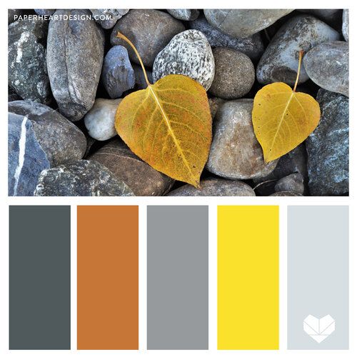
The relationship between light and colour is a fundamental aspect of design. How light interacts with surfaces, finishes, and fabrics profoundly impacts colour perception. Understanding this dynamic interplay is essential for creating visually captivating and harmonious designs. In interior design, the selection of colours plays a significant role in creating the desired atmosphere and mood. This article will explore how light affects the selection of colours on different surfaces, finishes, and fabrics. By gaining insights into this phenomenon, individuals can make informed choices and create stunning colour schemes that transform spaces. Aspiring designers looking to enhance their understanding and skills in interiors may consider exploring opportunities such as a design course to expand their knowledge further.
The Role of Light in Color Perception:
Light is the primary source of colour; without it, colours would not exist. Light interacts with its surface when it strikes an object, and certain wavelengths are absorbed or reflected. The reflected wavelengths then enter our eyes, where they are processed by our visual system, enabling us to perceive colours. The quality and intensity of light and the object’s surface characteristics all contribute to how we perceive colour. Different lighting conditions can create variations in colour appearance, making it essential to consider lighting when selecting colours for surfaces, finishes, and fabrics.
Natural Light vs. Artificial Light:
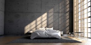
Natural light, originating from the sun, is a dynamic and ever-changing light source. Its intensity and colour temperature vary throughout the day, affecting how colours are perceived. The warm, golden hues of morning and evening light create a cozy and inviting atmosphere, while the cooler, bluish tones of midday light offer a crisp and vibrant appearance. On the other hand, artificial light is generated by man-made sources such as incandescent, fluorescent, and LED bulbs. Each type of artificial light has its colour temperature, which can influence colour perception differently. Understanding the differences between natural and artificial light is crucial for selecting colours that look their best in specific lighting conditions.
Colour Temperature and Color Rendering:
Did you know that the warmth or coolness of light is measured in Kelvin (K)? That’s right, it’s called colour temperature, and it can greatly affect the look and feel of a space. Lower colour temperatures, around 2700K to 3000K, produce warm, yellowish light similar to candlelight or sunrise. Higher colour temperatures (around 5000K to 6500K) produce cool, bluish light, resembling daylight or overcast skies. Colour rendering refers to how accurately a light source can reproduce colours compared to natural light. Light sources with high colour rendering index (CRI) values, such as natural daylight, accurately render colours, while those with lower CRI values may distort or alter colour perception. To ensure desired colour accuracy and consistency, consideration of colour temperature and colour rendering is vital when selecting colours for different surfaces, finishes, and fabrics.
Surface and Finish Considerations:
The surface and finish of an object greatly influence how light interacts with it and, consequently, how colours are perceived. Smooth and glossy surfaces reflect more light, creating more vivid and saturated colours. On the other hand, matte or textured surfaces diffuse light, creating a softer and more muted colour appearance. When selecting colours for different surfaces and finishes, it is important to consider their light reflectance properties. Highly reflective surfaces may require colours with less saturation to avoid overwhelming the space. In contrast, less reflective surfaces may benefit from bolder and more saturated colours to enhance their visual impact.
Light Transmission and Color Absorption
Fabrics present another dimension of colour perception, as they can transmit, absorb, or reflect light to varying degrees. Light transmission refers to how much light passes through a fabric, affecting its overall transparency and the colours it presents to the viewer. Light-absorbing fabrics can give a deeper and more saturated appearance while light-reflecting fabrics can create a brighter and more luminous effect. When choosing materials for different applications, consider how they interact with light and how that influences the desired colour outcomes. For example, sheer fabrics may soften and diffuse colours, while opaque fabrics can deliver more vibrant and saturated hues.
Enhancing Color Accuracy and Ambiance
A thoughtful lighting design can greatly enhance colour accuracy and create the desired ambience in a space. By strategically placing light fixtures, adjusting their intensity, and selecting the appropriate colour temperature, designers can optimize the perception of colours on various surfaces, finishes, and fabrics. Accent lighting can highlight specific objects or areas, while ambient lighting sets the overall mood and provides general illumination. Designers can control light and colour through lighting design, creating a harmonious and visually captivating environment.
Conclusion:
The interplay between light and colour is a captivating design aspect, particularly in interiors. How light interacts with surfaces, finishes, and fabrics influence how colours are perceived and experienced in space. By considering natural and artificial light, colour temperature, colour rendering, surface reflectance, and fabric properties, designers can make informed choices that result in visually captivating and harmonious designs. Understanding how light affects colour selection allows designers to create desired atmospheres and moods, transforming spaces into unique and engaging environments. For people interested in delving deeper into the world of design, pursuing an interior design course can provide valuable knowledge and skills to excel in this creative field. By embracing the dynamic relationship between light and colour, designers can unlock the transformative power of colour and create spaces that truly inspire.


Be First to Comment